New Homework Readings, 2 Articles
Data Density and Small Multiples and Aesthetics and Technique by Mr. Tufte were interesting articles and raised many interesting topics of possible discussion. My stream of conciousness notes include a few thoughts on the papers: Some of the graphics were neat to look at because I don't read french and I can't read music, so these were neat symbolic representations of images that could be resolved with different effects than the standard text I've been working with here in Fairfax City for the past few years on the standard font Jpeg resolution data transfer standards issues- calligraphy and drawn images seem to have additional challenges when manipulating image size and legibility into computer documentation is one of many lessons that we could learn from Mr. Tufte's comprehensive assessment. The most pertinent things that come to mind, and perhaps this is because I've been reading books and doing projects on them for grad school stuff, is the almost coincidental pertinence to natural science dynamics modeling of statistical data for general readership publications and news papers. For instance, and I did a homework excercise on it already, one of the project ideas I had for this class was animating an Ozone Hole. Why? Because people have a really hard time visualizing it, according to the many published interviews with conservationists who answer journalists questions expressing doubt and disbelief that there could be an atmospheric hole floating above our heads so far above that we need to be concerned about it at all. The confusion among environmentalists in the question-response sessions I read about when doing article studies for another design class seemed to me to stem from the way the scientists phrased their explanations of "ozone holes". Most news articles when this was a crisis had pictures of the Los Angeles Sky tinted with grey pollution as pictures of the hole. Or pictures of the Sun shining on glaciers in the Arctic. These images were frequently accompanied by text explanations of the CO2 process, but failed to make use of simple statistical charts which would have been 100 percent times more understandable, would have taken up aout a tenth of the page space, and would have saved the printers tons of money on the expensive inks required to print the high color graphics of naturalist's photo's of polluted city skylines. Why is it of note? Because it explains the situation where you have a very large graphic that could be condensed on the page to contain printers formats, but not actually be shaped like a hole. That's when a line chart would come in, to profile the migration pattern of the Ozone hole across the globe. I remember that Aerosol studies were conducted En Masse during the 1970's trying to capture the particulate distributions of can emissions of a variety of inexpensive cleaning products that were relatively safe in liquid form, and relatively safe in the air at earth level and temperature, but when gravitating towards the upper atmosphere and mixing with higher chemicals, could be considered really dangerous to the environment. The Ozone Hole example could be considered as a Maximal Multiple, where the "shrink principle" no longer applies becuase the photo reduction would no longer capture the data, and it would be necessary to switch to a statistical diagram, which wouldn't be as graphically dramatic as a photo-spread with full color graphics. The Aesthetics article makes an argument for eye-balling data to be represented then and getting the ideal image element placement proportions about right, which isn't difficult since incidentally it has generally been fixed through limited possible arrangements of text boxes and software graphics that are conducive to these few configurations. Nevertheless, in a science context, these kind of graphicky-statistics end up looking more statistically valid then they really are, since the data follows a distribution dependent on datapoints that no longer express the same relationship that the original was designed to portray. Thus, the images used to present the explanatory context of the data can be unsatisfactory to the map-image-design. But they can still be pleasing to look at, as in most of the beautiful illustrations presented in the two papers.
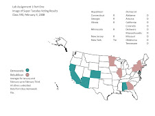
Political Map Example
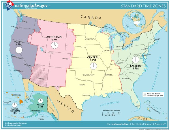
Time Zones Regional Agreement
Lab One Homework One
Static Image
