My link to my final Project is here. The major points I tried to consider were:
1. how to present statistical data in an animated format without changing the data from the source.
2. how to keep alot of numbers on only two pages.
3. how to have an alternate presentation of the data that was across several years,
4. how to have a spatial portrayal of the natural breaks in the data that didn't promise more accuracy than was there directly from the numbers.
Lab 10 Homework
 http://mason.gmu.edu/~esuski1
The first time I used the camera I got frame effects such as zooms and transformations of the frame space,but not on an animation.
On the second image file I tried, I made a regular animation that would support the buttons for start/stop, while creating the scene movie clip for a designated frame. This didn’t work as simply with the camera view as on the first file.
On the second image file I tried, I made a regular animation that would support the buttons for start/stop, while creating the scene movie clip for a designated frame. This didn’t work as simply with the camera view as on the first file.
Then I tried a new revolving image animation, and applied the camera to the animation. I couldn't find how to place the camera scene appropriately, but it sort of works. Keeping the buttons in frame requires more planning.
Lab 9 Homework
I did the lab from the link and tried to import this loader animation to my library, but it was really slobby looking and although it had worked in the lab, it didn't preserve animation once I put it on the flash page. I am still trying to figure out a couple of items with the action script "stub file" where the individual swfs should go, and what's redundant between the script layers on the individual files vs. the extraneous code snippet file. Buttons have been flying everywhere while I try to figure it out. I'm out of time. Here's Jpegs of my progress, the fourth map disappeared.


New Homework Readings, 2 Articles
Data Density and Small Multiples and Aesthetics and Technique by Mr. Tufte were interesting articles and raised many interesting topics of possible discussion. My stream of conciousness notes include a few thoughts on the papers: Some of the graphics were neat to look at because I don't read french and I can't read music, so these were neat symbolic representations of images that could be resolved with different effects than the standard text I've been working with here in Fairfax City for the past few years on the standard font Jpeg resolution data transfer standards issues- calligraphy and drawn images seem to have additional challenges when manipulating image size and legibility into computer documentation is one of many lessons that we could learn from Mr. Tufte's comprehensive assessment. The most pertinent things that come to mind, and perhaps this is because I've been reading books and doing projects on them for grad school stuff, is the almost coincidental pertinence to natural science dynamics modeling of statistical data for general readership publications and news papers. For instance, and I did a homework excercise on it already, one of the project ideas I had for this class was animating an Ozone Hole. Why? Because people have a really hard time visualizing it, according to the many published interviews with conservationists who answer journalists questions expressing doubt and disbelief that there could be an atmospheric hole floating above our heads so far above that we need to be concerned about it at all. The confusion among environmentalists in the question-response sessions I read about when doing article studies for another design class seemed to me to stem from the way the scientists phrased their explanations of "ozone holes". Most news articles when this was a crisis had pictures of the Los Angeles Sky tinted with grey pollution as pictures of the hole. Or pictures of the Sun shining on glaciers in the Arctic. These images were frequently accompanied by text explanations of the CO2 process, but failed to make use of simple statistical charts which would have been 100 percent times more understandable, would have taken up aout a tenth of the page space, and would have saved the printers tons of money on the expensive inks required to print the high color graphics of naturalist's photo's of polluted city skylines. Why is it of note? Because it explains the situation where you have a very large graphic that could be condensed on the page to contain printers formats, but not actually be shaped like a hole. That's when a line chart would come in, to profile the migration pattern of the Ozone hole across the globe. I remember that Aerosol studies were conducted En Masse during the 1970's trying to capture the particulate distributions of can emissions of a variety of inexpensive cleaning products that were relatively safe in liquid form, and relatively safe in the air at earth level and temperature, but when gravitating towards the upper atmosphere and mixing with higher chemicals, could be considered really dangerous to the environment. The Ozone Hole example could be considered as a Maximal Multiple, where the "shrink principle" no longer applies becuase the photo reduction would no longer capture the data, and it would be necessary to switch to a statistical diagram, which wouldn't be as graphically dramatic as a photo-spread with full color graphics. The Aesthetics article makes an argument for eye-balling data to be represented then and getting the ideal image element placement proportions about right, which isn't difficult since incidentally it has generally been fixed through limited possible arrangements of text boxes and software graphics that are conducive to these few configurations. Nevertheless, in a science context, these kind of graphicky-statistics end up looking more statistically valid then they really are, since the data follows a distribution dependent on datapoints that no longer express the same relationship that the original was designed to portray. Thus, the images used to present the explanatory context of the data can be unsatisfactory to the map-image-design. But they can still be pleasing to look at, as in most of the beautiful illustrations presented in the two papers.
Lab 9
For this lab-work excercise, I took a revised copy of the lab 8 (which ran the preloader animation at an accelerated rate that was really annoying but within the five frame and 12fps rate outlined in the lab. I left it alone, and instead of making new thumbnail images for each of the four maps, I placed these in different places on the four maps individually. Since I couldn't see the stubs after frame four, the action script stub file for the first map version only had any effect after the animation ran. I went to the recommended LSMS web-site and am working through them today.http://mason.gmu.edu/~esuski1
Museum Visit
I accompanied the class trip to the Museum on Saturday, April 12 and it was the first time I had visited this Museum so it was a doubly pleasant surprise to see both the Map exhibit and the permanent collections.
- There were many rooms full of interesting things from many other collections, and also included a few maps that I did not know were in the permanent collections from the National Gallery of Art.
- Many of the over-sized map products were interesting because they retained the folding element in the table cases. (For example the Road Network Map from 1694).
- The clarity of strong characteristic regional elements contrasted from different parts of the world was interesting in terms of map design elements, since many of the insets and symbols were actually the same size as flash buttons, a natural continuity, I thought. Maybe the preferred aesthetics of certain graphic symbols has been optimal at a certain size over time and across cultures, or maybe it has averaged out over time that there is an optimal "type" range that is still expressed today in terms of fonts, even though we are no longer technologically limited to a certain print size.
- Most of the maps could be read at standing distance, so it was a very up close exhibit. I didn't see any bill-board sized text like we have today on advertisements, like "turn left at Shoneys" next exit maps. In comparison to the exhibit maps, today's map products seem to have gotten less intended for individualized or select audiences these days.
- The lettering on the maps was very literary, and manuscript sized, with not too much over-large text, even on the larger maps. However, the individuation of the regional symbolism seemed to follow a set of protocols that maybe isn't that far off from the kinds of style freedoms that are homogenized through computer software and printing technology like we've been working with. I'd like to go back and see the exhibit again.
- Additionally the gift store also had all kinds of mappy things, and had a representative selection of map-prints. I was also pleasantly surprised to see that the cafe had vegetarian selections that were affordable, since I'm a vegetarian, and also the coffee was tastee and could be consumed in line while standing and waiting to enter the exhibit. I enjoyed the day trip!

Homework Lab 8
I tried the button-movie clip suggestion posted on e-mail, but all this did was animate the movie-clip buttons into a moving button display. Masking areas on the view was difficult since the shape is not in view. http://mason.gmu.edu/~esuski1
Decorative map of both hemispheres
Alot of webmaps have strong decorative elements. I found a good example of a wall map that is primarily a decorative map. Its elements as a good example of map design are clearly evident even at this scale. A decorative map is a pleasing image that you might not actually want to use as a reference. Nevertheless, even a decorative map localizes the map viewer in reference to a world view. The decorative element emphasizes the frequent use and interest in maps for their soothing image qualities as can be seen from this jpeg of the map.

Title on Web Page vs. Map Page
This is an exciting internet planet map. I got it at Maps.com, a web-site where there are school-room maps. They all have titles, are clearly labeled, and allow the viewer to read the information such as states and countries, on the map and on the web-page. If you can't read the title on a computer image of a map, the web format allows the title and supporting data to be outside the image frame, but still on the same "page". That's important to pre-design of a map for computers that isn't there for paper maps, where the explanation has to fit on the paper itself. I thought this was a good example where the inclusion of a title right in the vicinity of the planetary views would have interfered with the design and uncluttered distant space look of it.


Faster flash 3/7
The prehistoric dig animation uses a good example of a shape tween, where moving and clickable hammers seem to chip away at different areas of the rock to reveal the image of different fossils. The link is to "Sea Monsters" and is a good example of a button interactive site incorporating full graphics and images into map-like environments with multiple point and click layers that can be stopped by the viewer for text information and historical reading on the subject matter. This is a type of map that is almost more like a movie that can be stopped in it's tracks and querried for the ideal combination of moving images, map format, and many selectable links. There are almost no loading times, and the site's interactions are fast, and movie paced. There's a map animation that moves forward and backward across the milleniums of pre-historic creatures, and each monster looks like it's going to bite the viewer's head off while the viewer reads the supporting captions. It can be found on the web-page link to http://plasma.nationalgeographic.com/mapmachine

Lab Four
I tried the transparency in frame one alone and compared it to the way we did the superbowl.
Getting the buttons to be selectable wasn't working in Frame one. But here's an idea for a manual coordination check-box game in the meantime while I try to figure out why the line instructions don't work.
Getting the buttons to be selectable wasn't working in Frame one. But here's an idea for a manual coordination check-box game in the meantime while I try to figure out why the line instructions don't work.


map without a zoom button 2/ 29
This Map from Zambia, Africa is an example of an excerpt from a world map. It illustrates typical problems of web-posting images of detailed or exotic reference maps on a public site. The rhetorical and class-required examples of weather maps on my required personal blog were examples of maps specifically designed for web-publishing, The reference map examples in this collection were examples of those kinds of maps initially not designed for publishing. The bright orange and green colors on the Zambia map and the high detail which caters to area researchers indicate that this map was not intended with interactivity in mind. The lack of explanatory panels on the archive collection of titles also indicates that the site is not intended to be educationally interactive, nor is it intended for a larger audience. Clearly, it records and documents. Additionally, the obscure and eclectic nature of the map content indicate that the map is not intended for general readership, but simply notes documentation meta-data.

Map Review
February 11-15, Weekly Map Design Review
These two maps are good examples of strong map image design for the web. I have included an example of a type of simple animation that clearly and effectively shows the physical dynamic being modeled. This is contrasted witha static web-map which could have used web-animation but did not. In the first map, the animation runs for a full 10 frames of sequential motion and then repeats upon use of a button. This example illustrates how physical principles can be geographically portrayed with a legend, title, and area map that conveys information at a glance, either frozen statically or in motion. The other static map image uses the same geographic representation, but spells the numbers out in Fahrenheit , with the aid of additional colors to convey temperature extremes. Standard colors used for hot and cold are red and blue, with certain conventional variations from the color tool palette.
These two maps are good examples of strong map image design for the web. I have included an example of a type of simple animation that clearly and effectively shows the physical dynamic being modeled. This is contrasted witha static web-map which could have used web-animation but did not. In the first map, the animation runs for a full 10 frames of sequential motion and then repeats upon use of a button. This example illustrates how physical principles can be geographically portrayed with a legend, title, and area map that conveys information at a glance, either frozen statically or in motion. The other static map image uses the same geographic representation, but spells the numbers out in Fahrenheit , with the aid of additional colors to convey temperature extremes. Standard colors used for hot and cold are red and blue, with certain conventional variations from the color tool palette.
Subscribe to:
Posts (Atom)
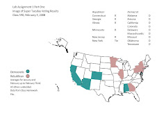
Political Map Example
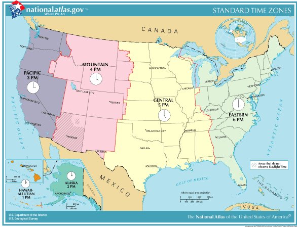
Time Zones Regional Agreement
Lab One Homework One
Static Image
